Radix UIComponent LibraryReactTypeScriptReusable UITailwind CSSFront-end ArchitectureCustomizable Components
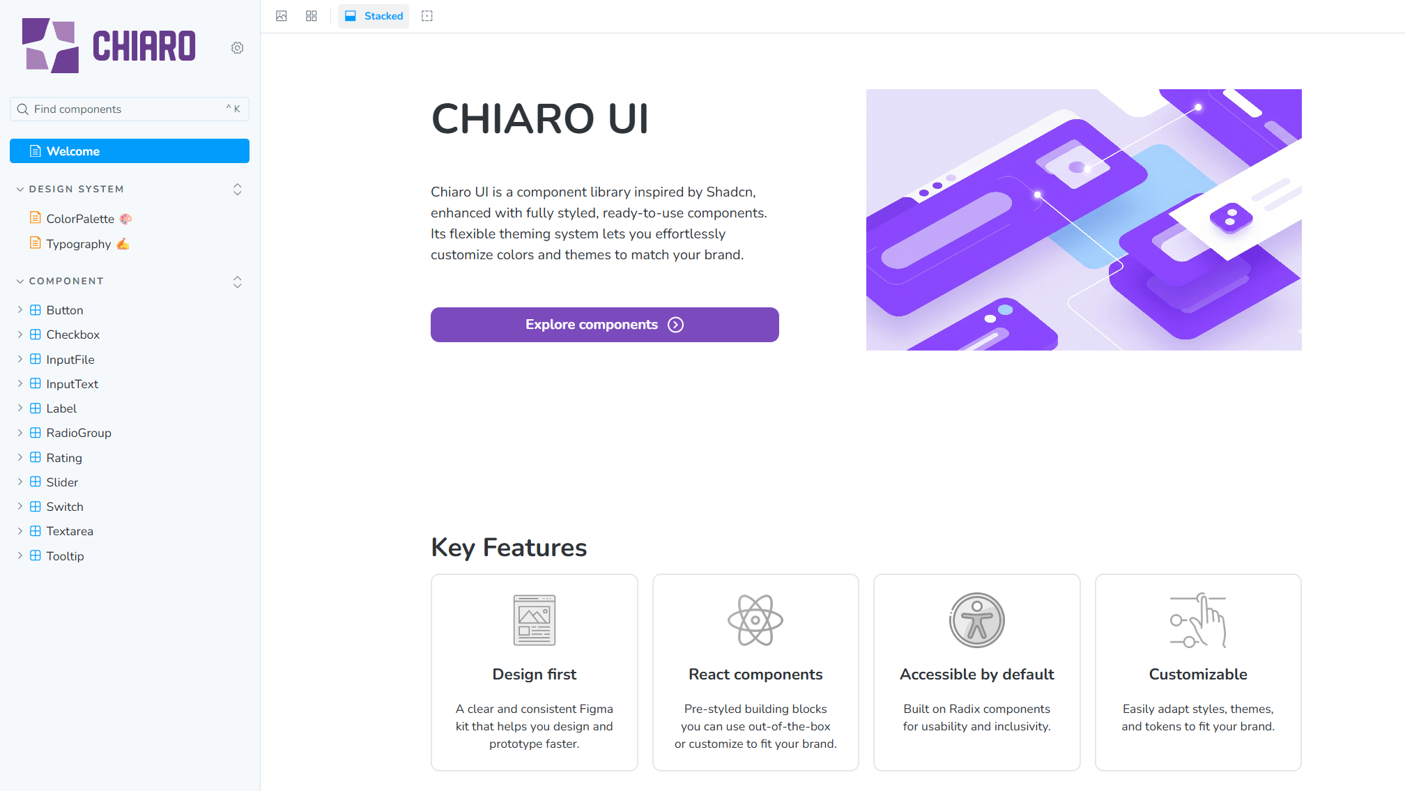
Custom UI library built with Radix, inspired by shadcn, offering reusable, flexible components with dark/light mode styling, developed in collaboration with a designer for rapid front-end development.
 Project Highlights
- Radix-Powered Foundation
Built components on top of Radix primitives to ensure accessibility and flexibility. - Reusable & Flexible Components
Created a set of reusable UI components that are easily customizable for different projects. - Dark/Light Mode & Designer Collaboration
Implemented dark/light mode styling and worked closely with a designer to align UI/UX vision. - Ready-to-Use Styling
Added basic styling for rapid front-end development, similar to popular UI libraries like Chakra UI and Material UI.